Standard Page
Description
Standard pages can be either a one column template or a two column template.
One column pages expand to the full width. Links to subsections need to be included in the content of the main page.
Two column pages include a left column that contains side navigation and an option for a call-to-action button and contact information.
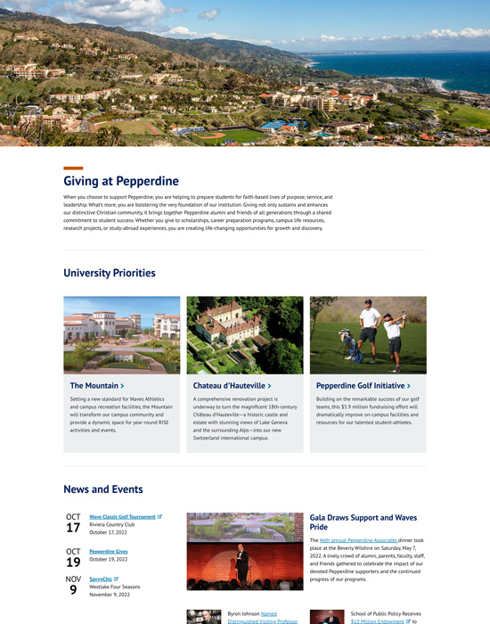
Standard One Column
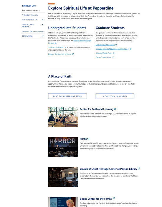
Standard Two Columns
Instructions
- If you are not logged on, see How to Log On to Modern Campus CMS.
- Click the Content tab.
- Navigate to the folder where the new webpage will go.
- Click the New button.
- Click the Standard Page.
- Select either a One Column or Two Columns page type.
Note: One column pages work well for main section pages and two column pages work well when a side navigation or other side column element should be present. - Add a title for the page.
Note: The Content Title appears in Google search results and social media sharing. It is also used as the page's first heading. - By default the Content Title will display at the top of the page. It is optional remove the content title from displaying.
- Add a description of the page.
Note: Think of it as one descriptive sentence for your page. Please do not simply copy the Content Title here.
Note: The Description appears in Google search results and social media sharing. - Optional: For Admins only - Check the Enable https Redirect if you need the page to always go over https.
- By default, each page has a side navigation. It is optional to turn off the navigation.
Note: On one column pages the side navigation will slide out from the left after clicking the navigation icon. On two column pages the navigation appears in the left side column. - Optional: It is optional to add an Impact Widget by selecting the type from the drop-down and
selecting the path to the impact widget.
Note: This will appear in a large area at the top of the page above the section and content titles and directly below the site main navigation and header. - Optional: It is optional to add social media groups to the page by checking the Display Connect
with Us and enter a path for the widget.
This will display social media icons on the top-right side of the page. - Optional: It is optional to add right side drawers for Anchor links and Social Sharing options.
Note: Side Anchors when selected will automatically add all anchors in order of appearance on the page's main content areas. It will not display anchors within widgets.
Note: The Side Social Share option will provide a list of common options for users to share the page to their social media account. - The rest of the page is arranged with alternating widget and main content sections
(see Editing Regions).
You may add up to four widgets in each widget section.
Widget rows will group all the widgets in that section in a block row so the main content section below it starts underneath in a new row. If not selected, the main content section will flow up into the available space surrounding the widgets.
When adding multiple widgets to a section it is recommended to select the widget row, but if you only have one widget floating left or right it is recommended to not select the widget row and let the content flow around it. - Optional: It is optional to select Widget Column to display the first set of widgets in a right
column at the top of the page.
Note: You may add a column title, select a size, and add a link. - Optional: It is optional to turn any group of widgets 1.1 - 1.4, 2.1 - 2.4, or 3.1 - 3.4 into a row of widgets. You may add a row title, select a size, and add a link.
- To add a widget select the widget type from the drop-down.
- Browse for an existing widget in the Path to Widget area.
- Select a widget Size
- Select a widget Position.
- Optional: It is optional to add a border around the widget.
- Repeat those steps for each widget added to the page.
- Note: Between each widget section is a main content section.
By default the Main Content Section 1 is active. - Optional: It is optional to add or remove Main Content Sections one, two, and three, and the Side Content Section, which displays in left column of two column pages.
- Give your page a filename.
Note: It is highly recommended to begin the name of the widget with its type followed by the purpose of the widget with hyphens in between. Do not enter a file extension, and make sure to only use lowercase letters, numbers, and hyphens. - Click the Create button.
- Click the Edit Content button.
- Add your main content.
Note: You can include text, images, and snippets here. - Save and Publish (see Basic Steps to Publish Content).
Review and Edit:
- To edit the page check-out the page and click the Edit Content button.
- To edit the widgets and content areas go to the Properties Button.
- Save and Publish