Color Deficiency Preparedness
As you prepare, revise, or revisit materials you might project on a screen, post on Courses, or hand out to your students, please consider the needs of viewers with various forms of color vision deficiency (CVD, also called colorblindness). The most common type of CVD, red-green deficiency, affects about 8.3% of men (1 in 12) and 0.5% of women (1 in 200), according to the NIH. You're unlikely to receive an accommodation letter from the Office of Student Accessibility about CVD, but it's a good practice to go ahead and design your course materials with CVD in mind.
The easiest way to do this is to limit your color palette. The only colors that look pretty similar across all varieties of human color vision are black and certain shades of blue, so the goal isn't for viewers with and without CVD to see the same thing. Rather, the goal is to use a color palette in which each color is easily distinguishable from the other colors in the palette, regardless of the viewer's color vision. The eight-color palette shown below meets this goal nicely.
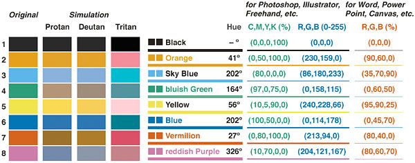
This chart is taken from "Color Universal Design" by Masataka Okabe and Kei Ito, a very detailed article on this subject with many other helpful tips.
If you use infographics, photographs, or other color-rich images and you'd like to see how viewers with various forms of CVD will perceive the images, a convenient Color Blindness Simulator is available online, allowing you to drag in any picture and then view it through various CVD lenses.
By the way, it turns out that Pepperdine's official shades of orange and blue are easily distinguishable from each other in all varieties of CVD, although some viewers may have difficulty distinguishing Pepperdine's dark blue from black.