Make Your Class Syllabus Accessible

Overview
A course syllabus is simply an outline of the academic content of a course. Each school will define the required elements of class syllabi, so refer to the dean's office of your school or speak with your department, program, or office leadership for those details.
In addition to the required content of a syllabus, you must also make sure that the document is accessible to all learners.
Core Elements of an Accessible Syllabus
- Organized Structure with Headings: Just as you require students to write well-organized papers and reports, your syllabus must flow logically and use the appropriate headings to help readers understand the hierarchy or levels of information within your document. You will apply the heading styles in Microsoft Word (Heading 1-9) to organize your content. Styles in Google Docs, Pepperdine Canvas Rich Content Editor, or the Pepperdine Syllabus rich text editor are similarly named..
- Text Size: We're not all blessed with 20/20 vision, unfortunately. To make your text content readable, be sure to use an appropriate font size. Avoid less than 12 point fonts and consider using "sans serif" style fonts like Arial, Helvetica, Open Sans, or Verdana. Steer clear of script or fancy fonts that may be difficult to read or interpret.
- Color Contrast: Just as we must be mindful of text size, we also need to keep colors and color contrast in mind when we are creating documents. While subtle design elements can appear elegant to select viewers, they can make text impossible to view by others. In general, use dark text on light backgrounds and vice versa. Consider a tool like WebAIM's Color Contrast Checker to verify compliance.
- Color and Meaning: Many of us associate colors with specific meanings or feelings. For example, we may use the color green to mean "good" and the color red to mean "bad." Not all of us can "see" colors the same way or may rely on screen readers to process web page content. Avoid using color alone to communicate meaning. Combine meaningful labels with color to promote understanding for all learners. Learn more about color accessibility.
- Alternative Text for Images: Whenever possible, avoid using images to convey critical, textual information. Rethink your approach if an image contains more than a few words. While a good image should "show, not tell," we must help our students or peers that can't view the picture or media. If using images with your content, whether as an illustrative example or for design aesthetics, always provide alternative (ALT) text to describe at least the purpose or intent of the image if not the precise content of the image itself. Learn more about alternative (ALT) text.
- Formal Lists: Whether you use numbered or bulleted lists, avoid using plain asterisks, hyphens, or numbers. Use the formal features within your word processor to structure your lists rather than manual entry.
- Formal Tables: Tables can be helpful to convey schedules or categorical information. Use the formal table features within your word processor and make sure that the table contains the appropriate column or row headers to provide all users context for the information/data contained within the table. Avoid using tables to simply structure your text content. Avoid using images to convey tabular information; this hinders the learning for some students and puts students with visual needs at a disadvantage to sighted students. Learn about accessible web data tables. In Microsoft Word, you'll designate a header row and enter alternative text; learn more about accessible Word data tables.
- Link Labels: We often have to refer to outside references, such as an official final exam schedule or the Office of Student Accessibility website. When working with web or other links, always use meaningful link labels that describe the purpose and/or destination of the link. Imagine that the link was listed by itself without surrounding text or context. Would the label "here" or "website" help anyone as a standalone item? No. Therefore, never use generic labels like "click here", "learn more", or "this website". Rewrite any sentence so that the web link is the clear object or final location. Learn more about writing descriptive link text.
- Use Proper Emphasis: When you need content to stand out, use standard emphasis (italics) or strong emphasis (bold). Avoid using underline formatting so that underlining can be reserved for web links only. Modern APA and MLA both use italics for book titles, for example. Also, minimize the use of ALL CAPS (all uppercase letters). While all uppercase can be used sparingly in select situations, it can be more difficult for some populations to interpret, process, or comprehend.
Pepperdine Syllabus "Rich-Text" Editor
If you build your syllabus using Pepperdine Syllabus, be sure to utilize the platform's automatic formatting and structure guidelines. Pepperdine Syllabus features built-in compliance guardrails that help you seamlessly organize required university policies, contact details, and course schedules into an accessible layout. Common issues—such as improperly formatted heading structures, low contrast text, and missing document markers—are minimized from the start because the platform automatically generates clean, screen-reader-friendly HTML for your students.
Pepperdine Canvas "Rich-Text" Editor
If you add syllabus content in the Syllabus tool (or as a page in Modules), be sure to use the built-in Accessibility Checker. This tool will scan the content in the editor for possible accessibility issues. Many issues can be quickly fixed.
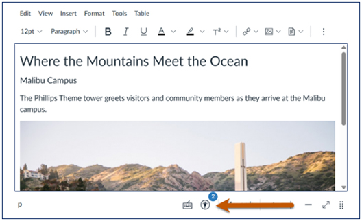
Canvas Rich Text Editor Accessibility Checker
Microsoft Office: Accessibility Checker
If your tool of choice for your syllabi is Microsoft Word, you are in luck! Microsoft offers a built-in Accessibility Checker for Microsoft Word, Excel, PowerPoint, and other Office applications.
Microsoft Office Accessibility Checker
Adobe Acrobat: PDF Accessibility Checker
If you distribute your syllabus as a PDF, then be sure to leverage the Accessibility Checker built into Adobe Acrobat Pro. All full-time Pepperdine University faculty are provided Adobe Acrobat with their University-owned laptop.
Adobe Acrobat Accessibility Checker
Google Workspace: Google Docs Accessibility
Are you using Google Docs to build your syllabus? Similar to Microsoft Word or PDF, you'll follow the same guidance for headings, images, and tablesAre you using Google Docs to build your syllabus? Similar to Microsoft Word or PDF, you'll follow the same guidance for headings, images, and tables.
![]()
Google Docs Accessibility (GrackleDocs)