University Logo
The Pepperdine logo is the foundational element of the University's visual identity and serves as the primary brand mark for use in all University marketing materials. The logo functions as a corporate sign-off or stamp of approval for the communication. The size and location of the logo should be discrete and should be positioned as a first or last read. In every case, the logo should be afforded adequate clear space around it to allow for ease of visibility (see below). The logo should always appear on each official Pepperdine communication vehicle, regardless of medium. It should never be treated as a title nor be incorporated into text.
Logo Availability
Since it's implementation in January of 2024, the new University logo is no longer distributed for general use. This is to ensure it's integrity and visibility across all platforms and media. The logo is now an integral part of all major communication platforms at the University—web, email, mobile app, social media, and event registration. Launched in 2024, the Marq platform now enables stakeholders to create their own print collateral with the logo "baked in" to the templates in the appropriate manner. In special cases—such as premiums created by third-party vendors—IMC will share the logo directly with the vendor.
Logo Construction
The logo is comprised of two main components—the name "Pepperdine University" and and a shield icon. With this arrangement, Pepperdine is represented both in word and image. The six schools and any University-level group (Human Resources, Office of the President, Hub for Spiritual Life, etc.) may become part of the logo with their name replacing the word "University."
"Pepperdine University" is rendered in plain type without decoration or alteration. The brand trademark, strength, and recognition comes from the uniqueness of the Pepperdine name and therefore it does not need to carry any unique visual cues. That responsibility lies with the shield icon.
The shield icon carries the primary visual identifiers for the University including the theme tower and the brand colors of blue and orange. By itself it is considered the University academic mark (as opposed to the University seal which is the University heritage mark).
Please contact Courtney Gero, Assistant Director of Creative, for information about the logo and to obtain or request one for specific needs.
The obligation to create and maintain all enterprise-wide brand visuals rests with Integrated Marketing Communications. No other person or department acting as an official representative of the University is allowed to create or develop a unique brand mark for their own purpose. This is especially important for any communication or marketing materials that reach an audience outside the local campus environment, since an overabundance of unique identities dilutes the strength of the brand identity of the University as an enterprise.
Logo Clear Space
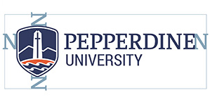
| The logo is like a house with a fenced yard, where only a limited number of things are allowed to cross the fence into the yard. In logo language this fenced yard is called "clear space." When using the logo make sure that no other information or graphics crosses the clear space. This allows the logo to be clearly recognized and seen. The clear space rule is measured by the letter "N" in Pepperdine. As it rotates around the logo it established the clear space. |  |
Logo Color
The logo is built with blue letters or white letters. Use the blue letter logo on light or white backgrounds, and the white letter logo on dark backgrounds. The shield icon is blue, white, and orange, and is designed to work on all backgrounds.
Placement over photos
The logo should never be placed over a busy photographic or decorative background where its legibility is impeded. Placement of the logo over photos with solid color areas are generally safe as long as the proper contrast is maintained.
Proximity to other unique marks or logos
The logo should never be combined with any other unique marks or logos. When used in proximity to other unique marks or logos, the logo should maintain the proper clear space (see Clear Space above). Keeping the proper amount of clear space between the Pepperdine logo and other unique marks not only allows it to be more visible, but also clearly identifies itself as a unique brand. This relationship is especially important in instances where Pepperdine is a co-branded with another entity as part of a larger enterprise.
Placement in space
The logo is first and foremost a mark which informs the reader that what they are reading is officially sanctioned by Pepperdine University. It is the stamp of approval from the University. Therefore, the logo should be a first or last read on any communication piece (it can also be first and last). Its size should be modest and should never be the dominant element on the page.
The logo should never be used as the title of any communication piece, a part of the title, or used in paragraph text. It should always stand apart from the rest of the content (see Clear Space above). When used in a multi-page or multi-panel piece, it only needs to appear once on the front, once on the back, or both.
Pepperdine Shield Icon usage
 |
The Pepperdine shield icon represents the University in spaces where the full logo will not fit. These include the Pepperdine mobile app face, social media, and favicons. The Athletics "P" (with the wavy top) is part of the Athletics brand identity system and should not be used to represent the University. Its usage is restricted to Athletics only. |
